Introduction
Material UI offers a wide range of component and utilities that empowers developers with the appropriate tools to create more responsive web designs and bolster the UX of their apps. A checkbox is a small box that, when selected by the user, indicates that a specific feature or option has been enabled. Material UI provides this valuable component on a platter and makes them customisable to apply to your project fittingly. This article will deeply traverse the Material UI Checkbox component, investigate its processes and highlight its syntax application. We will also explore a potential use case in a real-world application.
Steps we'll cover:
- What is Material UI?
- Getting started with MUI Checkbox
- Customizing your MUI Checkbox
- Other handy features
- When to use the MUI Checkbox
- MUI Checkbox Accessibility
What is Material UI?
Material UI is a powerful and efficient tool that simplifies web design by providing ready-made components and technically available utilities. It is a design language created by Google in 2014. It can be used with all JavaScript frameworks and libraries, such as AngularJS and VueJS, to make the application more amazing and responsive. Material UI is one of the top React User Interface libraries, with over 35,000 stars on GitHub. Many developers now structure their projects with Material UI because it simplifies and improves web design.
Material UI comes with several component categories, including Layout, Navigation, Feedback, Data display components, Input components, e.t.c.
The MUI Checkbox is a striking example of the Input components.
Getting started with MUI Checkbox
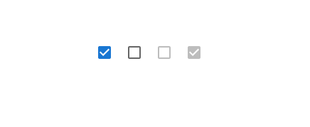
MUI Checkboxes allow you to choose an option out of a list of options to represent the response(s) to a question or a preferential choice(s) on a particular subject. Checkboxes can be used to toggle between options. To save space, use checkboxes instead of on/off switches when multiple options exist.
Below is a simple illustration of how you can typically import and use the Material UI Checkbox in your next project:
import * as React from 'react';
import Checkbox from '@mui/material/Checkbox';


export default function Checkboxes() {
  return (
    <div style={{margin: '25%'}}>
      <Checkbox defaultChecked />
      <Checkbox />
      <Checkbox disabled />
      <Checkbox disabled checked />
    </div>
  );
}
Here’s the result:
Customizing your MUI Checkbox
The Material UI Checkbox showcases the dynamism of the MUI framework because it offers several props and utilities with which you can easily customise it to fit your web application. Below are some ways to use the MUI Checkbox:
Adding Labels
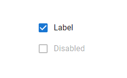
The FormControlLabel component allows you to give the Checkbox a label.
import * as React from 'react';
import FormGroup from '@mui/material/FormGroup';
import FormControlLabel from '@mui/material/FormControlLabel';
import Checkbox from '@mui/material/Checkbox';

export default function CheckboxLabels() {
  return (
    <FormGroup>
      <FormControlLabel control={<Checkbox defaultChecked />} label="Label" />
      <FormControlLabel disabled control={<Checkbox />} label="Disabled" />
    </FormGroup>
  );
}
Controlling the Checkbox Size
The size prop denotes the size of the component. You can customise the size of your MUI Checkbox with the size prop. Here’s how:
import * as React from 'react';
import Checkbox from '@mui/material/Checkbox';


export default function SizeCheckboxes() {
  return (
    <div style={{margin: '25%'}}>
      <Checkbox defaultChecked size="small" />
      <Checkbox defaultChecked />
      <Checkbox
        defaultChecked
        sx={{ '& .MuiSvgIcon-root': { fontSize: 28 } }}
      />
    </div>
  );
}

Controlling the Checkbox Color
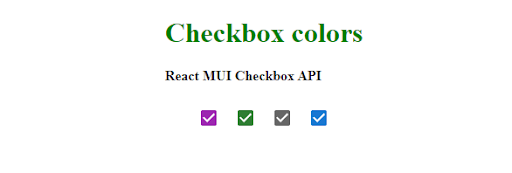
You can customise the color of your MUI Checkbox with the color prop like this:
import * as React from 'react';
import Checkbox from '@mui/material/Checkbox';

export default function BasicButtonGroup() {
    return (
        <div>
            <div
                className="head"
                style={{
                    width: "fit-content",
                    margin: "auto",
                }}
            >
                <h1
                    style={{
                        color: "green",
                    }}
                >
                    Checkbox colors
                </h1>
                <strong>React MUI Checkbox API</strong>
                <br />
                <br />
            </div>
            <div
                style={{
                    width: "fit-content",
                    margin: "auto",
                }}
            >
                <Checkbox color='secondary' />
                <Checkbox color='success' />
                <Checkbox color='default' />
                <Checkbox color='primary' />
            </div>
        </div>
    );
}
Here’s the result:
Label Placement
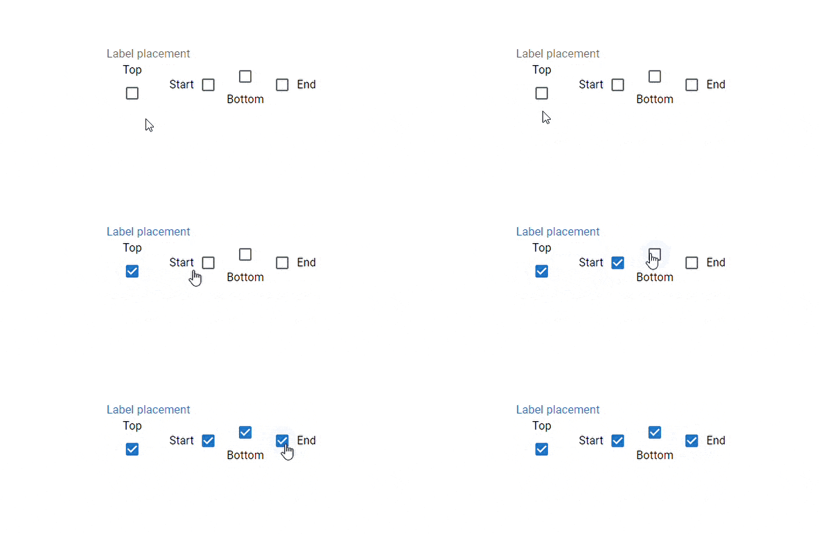
You can customise your Checkbox labels to be positioned on the top, bottom, start or end of the checkbox.
Check this out:
import * as React from 'react';
import Checkbox from '@mui/material/Checkbox';
import FormGroup from '@mui/material/FormGroup';
import FormControlLabel from '@mui/material/FormControlLabel';
import FormControl from '@mui/material/FormControl';
import FormLabel from '@mui/material/FormLabel';

export default function FormControlLabelPosition() {
  return (
    <FormControl component="fieldset">
      <FormLabel component="legend">Label placement</FormLabel>
      <FormGroup aria-label="position" row>
        <FormControlLabel
          value="top"
          control={<Checkbox />}
          label="Top"
          labelPlacement="top"
        />
        <FormControlLabel
          value="start"
          control={<Checkbox />}
          label="Start"
          labelPlacement="start"
        />
        <FormControlLabel
          value="bottom"
          control={<Checkbox />}
          label="Bottom"
          labelPlacement="bottom"
        />
        <FormControlLabel
          value="end"
          control={<Checkbox />}
          label="End"
          labelPlacement="end"
        />
      </FormGroup>
    </FormControl>
  );
}
Here’s the result:
Checkbox Icons
The material UI Checkbox component can be represented in the form of icons.
import * as React from 'react';
import Checkbox from '@mui/material/Checkbox';
import FavoriteBorder from '@mui/icons-material/FavoriteBorder';
import Favorite from '@mui/icons-material/Favorite';
import RecommendBorderIcon from '@mui/icons-material/Recommend';
import RecommendIcon from '@mui/icons-material/Recommend';


export default function IconCheckboxes() {
  return (
    <div style={{margin: '25%'}}>
      <Checkbox icon={<FavoriteBorder />} checkedIcon={<Favorite />} />
      <Checkbox
        icon={<RecommendBorderIcon />}
        checkedIcon={<RecommendIcon />}
      />
    </div>
  );
}

Other handy features
FormGroup
FormGroup is a handy wrapper for grouping selection control components.
import * as React from 'react';
import Box from '@mui/material/Box';
import FormLabel from '@mui/material/FormLabel';
import FormControl from '@mui/material/FormControl';
import FormGroup from '@mui/material/FormGroup';
import FormControlLabel from '@mui/material/FormControlLabel';
import FormHelperText from '@mui/material/FormHelperText';
import Checkbox from '@mui/material/Checkbox';

export default function CheckboxesGroup() {
  const [state, setState] = React.useState({
    mathematics: true,
    physics: false,
    chemistry: false,
  });

  const handleChange = (event: React.ChangeEvent<HTMLInputElement>) => {
    setState({
      ...state,
      [event.target.name]: event.target.checked,
    });
  };

  const { mathematics, physics, chemistry } = state;
  const error = [mathematics, physics, chemistry].filter((v) => v).length !== 2;

  return (
    <div style={{margin: '25%'}}>
    <Box sx={{ display: 'flex' }}>
      <FormControl sx={{ m: 3 }} component="fieldset" variant="standard">
        <FormLabel component="legend">Choose Subject</FormLabel>
        <FormGroup>
          <FormControlLabel
            control={
              <Checkbox checked={mathematics} onChange={handleChange} name="mathematics" />
            }
            label="mathematics"
          />
          <FormControlLabel
            control={
              <Checkbox checked={physics} onChange={handleChange} name="physics" />
            }
            label="physics"
          />
          <FormControlLabel
            control={
              <Checkbox checked={chemistry} onChange={handleChange} name="chemistry" />
            }
            label="chemistry"
          />
        </FormGroup>
        <FormHelperText>Be careful</FormHelperText>
      </FormControl>
      <FormControl
        required
        error={error}
        component="fieldset"
        sx={{ m: 3 }}
        variant="standard"
      >
        <FormLabel component="legend">Pick two</FormLabel>
        <FormGroup>
          <FormControlLabel
            control={
              <Checkbox checked={mathematics} onChange={handleChange} name="mathematics" />
            }
            label="mathematics"
          />
          <FormControlLabel
            control={
              <Checkbox checked={physics} onChange={handleChange} name="physics" />
            }
            label="Physics"
          />
          <FormControlLabel
            control={
              <Checkbox checked={chemistry} onChange={handleChange} name="chemistry" />
            }
            label="Chemistry"
          />
        </FormGroup>
        <FormHelperText>choose correctly</FormHelperText>
      </FormControl>
    </Box>
    </div>
  );
}
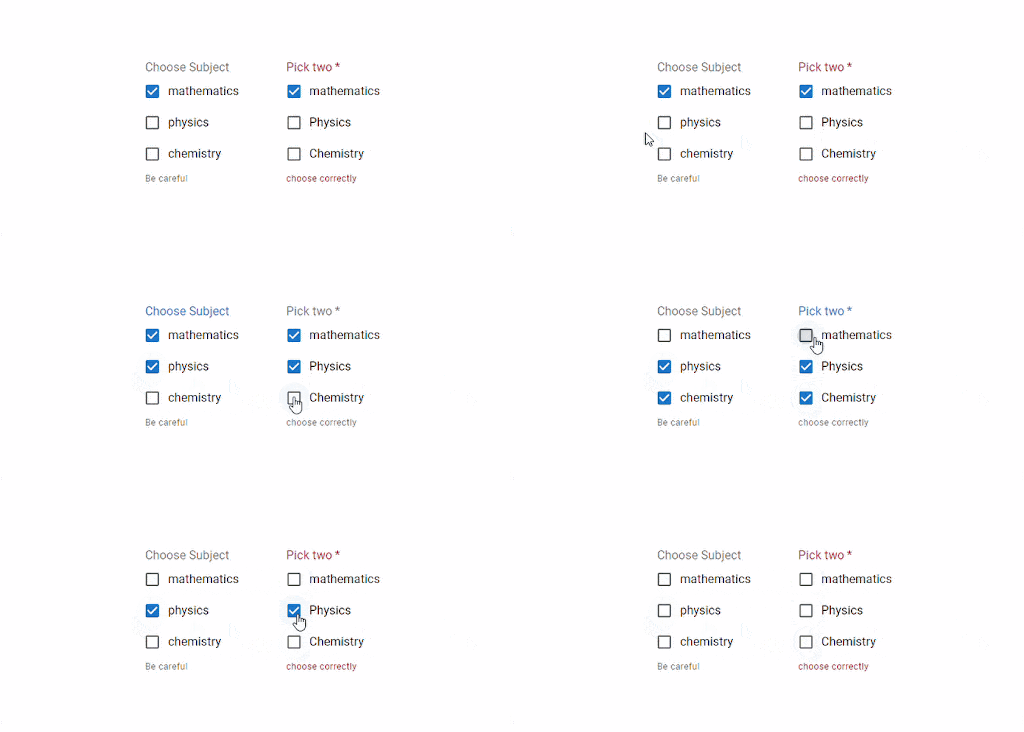
The code above displays a list of subjects for students ti choose from. The MUI Checkboxes are wrapped and rendered with the <FornGroup/> component.
Here’s the result:
Indeterminate
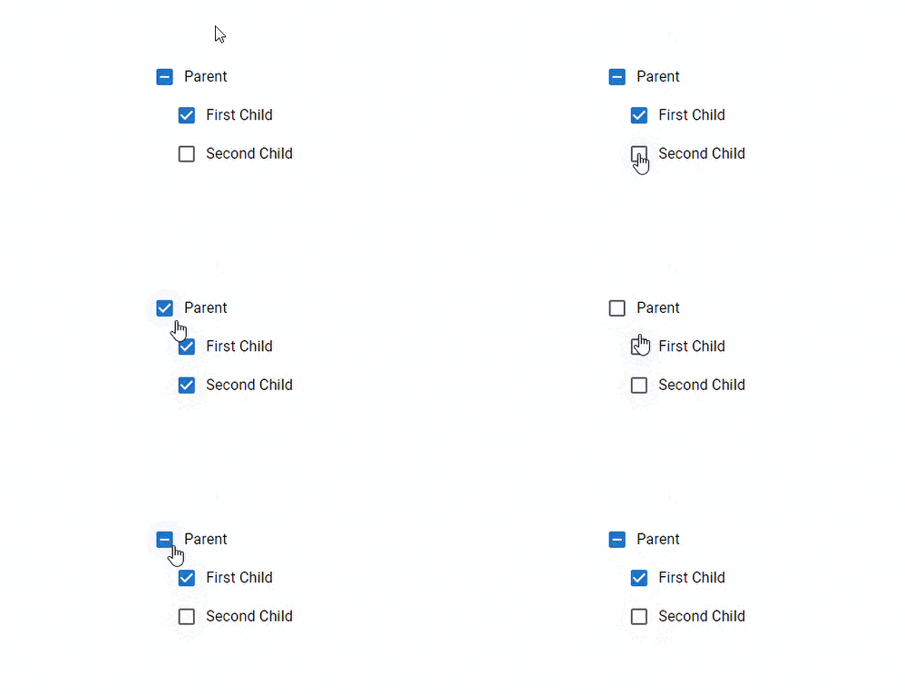
A checkbox can be in one of three states: checked, unchecked, or indeterminate. The indeterminate prop determines whether the component is in an unknown state.
import * as React from 'react';
import Box from '@mui/material/Box';
import Checkbox from '@mui/material/Checkbox';
import FormControlLabel from '@mui/material/FormControlLabel';

export default function IndeterminateCheckbox() {
  const [checked, setChecked] = React.useState([true, false]);

  const handleChange1 = (event: React.ChangeEvent<HTMLInputElement>) => {
    setChecked([event.target.checked, event.target.checked]);
  };

  const handleChange2 = (event: React.ChangeEvent<HTMLInputElement>) => {
    setChecked([event.target.checked, checked[1]]);
  };

  const handleChange3 = (event: React.ChangeEvent<HTMLInputElement>) => {
    setChecked([checked[0], event.target.checked]);
  };

  const children = (
    <Box sx={{ display: 'flex', flexDirection: 'column', ml: 3 }}>
      <FormControlLabel
        label="First Child"
        control={<Checkbox checked={checked[0]} onChange={handleChange2} />}
      />
      <FormControlLabel
        label="Second Child"
        control={<Checkbox checked={checked[1]} onChange={handleChange3} />}
      />
    </Box>
  );

  return (
    <div>
      <FormControlLabel
        label="Parent"
        control={
          <Checkbox
            checked={checked[0] && checked[1]}
            indeterminate={checked[0] !== checked[1]}
            onChange={handleChange1}
          />
        }
      />
      {children}
    </div>
  );
}
When to use the MUI Checkbox
Checkboxes vs Radio buttons
You may come to a point in your application's development where you need to set a list of options for users to choose from, and you may be unsure whether to use a Checkbox or a Radio button component to render this list. Well, this section will provide general UI guidelines on how to pick these components to match your application appropriately.
Radio buttons are useful when users must choose between two options that cannot both be true at the same time. In other words, clicking a non-selected radio button will deselect any other button in the list that the user previously selected. Checkboxes are more effective when users have the option of selecting two or more options. In other words, checking one checkbox in the list does not uncheck the others. A standalone checkbox represents a single option that the user can enable or disable.
Checkboxes vs Switches
For better context, switches are toggle buttons that represent a physical switch, such as a light switch, that allows users to turn things on and off. Tapping a toggle switch is a two-step action that involves selection and execution. In contrast, a checkbox simply selects an option, and its execution usually necessitates using another control. When choosing between a checkbox and a toggle switch control, consider the usage context rather than the function.
Use Checkboxes when: Use toggle switches when: Defined settings require a confirmation action before displaying results. A setting requires an on/off or show/hide function to display the results. The user has to perform additional steps for changes to become effective. The user must take immediate actions that do not require review or confirmation. The user must choose one or more options from a list of related items. The user is switching between independent features or behaviours. There is only one binary yes/no option. A single choice is required, and you want to provide two options for an on/off decision.
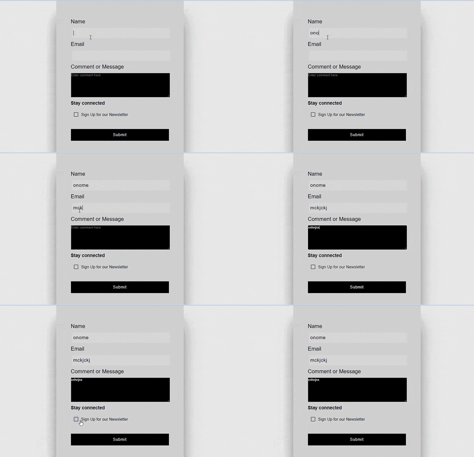
Building a Contact form UI with React and the MUI Checkbox The Material UI Checkbox can be incorporated into various aspects of a variety of web applications. For the sake of this article, we will explore a potential use case by building a simple contact form UI with the MUI Checkbox as a distinct component.
Here’s the code:
import * as React from 'react';
import FormGroup from '@mui/material/FormGroup';
import FormControlLabel from '@mui/material/FormControlLabel';
import Checkbox from '@mui/material/Checkbox';


export default function TransitionsTooltips() {
  return (
    <section className="login">
        <div className="loginContainer">
            <label>Name</label>
            <input
            type='text'
            autoFocus
            required
            />
            <label>Email</label>
            <input
            type='text'
            required
            />

            <label>Comment or Message</label>
            <textarea placeholder='Enter comment here'></textarea>

            <h3 style={{background: 'none'}}>Stay connected</h3>
            <FormGroup style={{background: 'none'}}>
            <FormControlLabel control={<Checkbox defaultChecked />} label="Sign Up for our Newsletter" />
            </FormGroup>


            <div className="btnContainer">
                        <button>Submit</button>
            </div>


        </div>
        </section>
  );
}
Here’s the result:
MUI Checkbox Accessibility
All form controls including Checkboxes, radio buttons and switches should typically have labels. In most cases, this is accomplished by utilising the
component. You can also add an attribute to the input component with theinputPropsprop. Some of these attributes includearia-label, aria-labelledby, and title`. <Checkbox
value="checkedA"
inputProps={{
'aria-label': 'Checkbox A',
}}
/>

