Introduction
Material UI is a popular front-end library for React that provides a comprehensive set of tools for creating user interfaces. One of the most valuable components of Material UI is the Modal, which allows developers to create a popup window that can display important information or facilitate user input. This tutorial will explain how to use the Material UI Modal and customize it to your needs.
What is Material UI?
Material UI is an open-source library of UI components created and maintained by Google. It employs Google's Material Design system, a visual language developed to unify the user experience across its products and platforms. Material UI components provide users with a natural and intuitive interface, making it easier to create products that look and feel the same across all devices. Material UI components are also highly customisable and can be tailored to the specific requirements of any project.
Material UI comprises several components and utilities that aid web design. The Material UI Modal is one of those utilities that aid visualization in a web app.
Getting started with Material UI Modal
The modal component is a solid foundation for creating dialogs, popovers, light boxes, and other interactive elements. Material UI Modal is a JavaScript library that you can use to create modal dialogs and pop-ups in web applications. It is lightweight and straightforward to use, with features such as customizing the look and feel of the modal, changing the size and position, and adding animation effects.
To start using the Material UI Modal, include the library and its stylesheet in your HTML page. Then you can create a modal window and customize its content, size, and animation effects. Finally, you can add the modal to the page using the mui-modal class. With MUI Modal, you can easily create modal windows for user interaction and feedback in your web application.
import * as React from 'react';
import Box from '@mui/material/Box';
import Button from '@mui/material/Button';
import Typography from '@mui/material/Typography';
import Modal from '@mui/material/Modal';

const style = {
  position: 'absolute' as 'absolute',
  top: '50%',
  left: '50%',
  transform: 'translate(-50%, -50%)',
  width: 400,
  bgcolor: 'background.paper',
  border: '2px solid #000',
  boxShadow: 24,
  p: 4,
};

export default function BasicModal() {
  const [open, setOpen] = React.useState(false);
  const handleOpen = () => setOpen(true);
  const handleClose = () => setOpen(false);

  return (
    <div style={{margin: '25%'}}>
      <Button onClick={handleOpen}>Open modal</Button>
      <Modal
        open={open}
        onClose={handleClose}
        aria-labelledby="modal-modal-title"
        aria-describedby="modal-modal-description"
      >
        <Box sx={style}>
          <Typography id="modal-modal-title" variant="h6" component="h2">
            Modal Header
          </Typography>
          <Typography id="modal-modal-description" sx={{ mt: 2 }}>
            Modal content
          </Typography>
        </Box>
      </Modal>
    </div>
  );
}
The code above illustrates how to use a simple MUI Modal with the provided utilities to convey a message or display an alert like this:
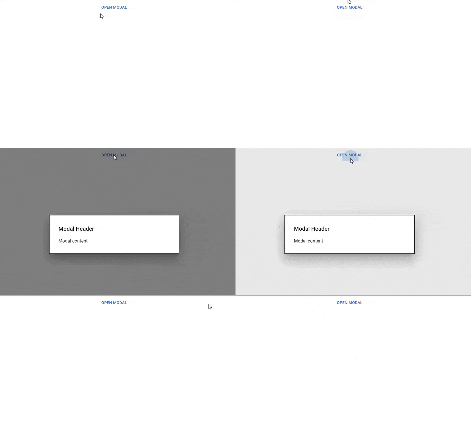
Note that: The term "modal" is sometimes used interchangeably with "dialog," but this is incorrect. A modal window describes various aspects of a user interface. An element is considered a modal if it prevents interaction with the rest of the application. In Material UI, Modal is a lower-level concept used by Dialog, Drawer, Popup and Menu components.
Material UI Modal props
MUI Modals are components that are used to both display important information to the user and receive user input. Modals are useful when you want to limit user interaction with the rest of the page but still require user input.. Props such as the title, size, and backdrop allow you to tailor the modal to your specific requirements. You can also change the modal's content by passing a component as a prop.
The following is a list of the various props that you can use with the MUI Modal component. We can access them and modify them according to our needs.
open: This prop controls the Modal's visibility. It only accepts Boolean values.
onClose: A callback function that is called when the Modal is closed.
disableEscapeKeyDown: You can use this prop to disable the escape key press, a keyboard shortcut for closing the Modal. It only accepts Boolean values.
fullWidth: This prop controls the Modal's width. It takes a Boolean value.
BackdropProps: This prop customizes the Modal's backdrop. It accepts a prop object.
disableBackdropClick: This prop disables the backdrop click, which is the click on the Modal's outside to close it. It only accepts Boolean values
E.t.c.
Customizing your Material UI Modal
Customizing your MUI Modal is a great way to make your website more user-friendly and visually appealing. With MUI Modal, you can customize the look and feel of your website with a few simple steps. You can change the size, color, and other elements of the modal to match the overall design of your website. You can also add custom animations and transitions to the modal, making it more interactive and enjoyable for your users. With MUI Modal, you can create an engaging and interactive experience for your website visitors.
MUI Modal Transitions
MUI Modal transitions are used to create a smooth and seamless transition within a modal or between two different modals. You can use a transition component to animate the modal's open/close state, but under the following conditions:
It must be a direct descendant of the modal
Have an in prop that corresponds to the open/closed state
Call the onEnter callback prop when the enter transition begins
Call the onExited callback prop when the exit transition is completed
import * as React from 'react';
import Backdrop from '@mui/material/Backdrop';
import Box from '@mui/material/Box';
import Modal from '@mui/material/Modal';
import Fade from '@mui/material/Fade';
import Button from '@mui/material/Button';
import Typography from '@mui/material/Typography';

const style = {
  position: 'absolute',
  top: '50%',
  left: '50%',
  transform: 'translate(-50%, -50%)',
  width: 400,
  bgcolor: 'background.paper',
  border: '2px solid #000',
  boxShadow: 24,
  p: 4,
};

export default function TransitionsModal() {
  const [open, setOpen] = React.useState(false);
  const handleOpen = () => setOpen(true);
  const handleClose = () => setOpen(false);

  return (
    <div style={{margin: '25%'}}>
      <Button onClick={handleOpen}>Open modal</Button>
      <Modal
        aria-labelledby="transition-modal-title"
        aria-describedby="transition-modal-description"
        open={open}
        onClose={handleClose}
        closeAfterTransition
        BackdropComponent={Backdrop}
        BackdropProps={{
          timeout: 500,
        }}
      >
        <Fade in={open}>
          <Box sx={style}>
            <Typography id="transition-modal-title" variant="h6" component="h2">
              Modal Header
            </Typography>
            <Typography id="transition-modal-description" sx={{ mt: 2 }}>
              Modal Content
            </Typography>
          </Box>
        </Fade>
      </Modal>
    </div>
  );
}
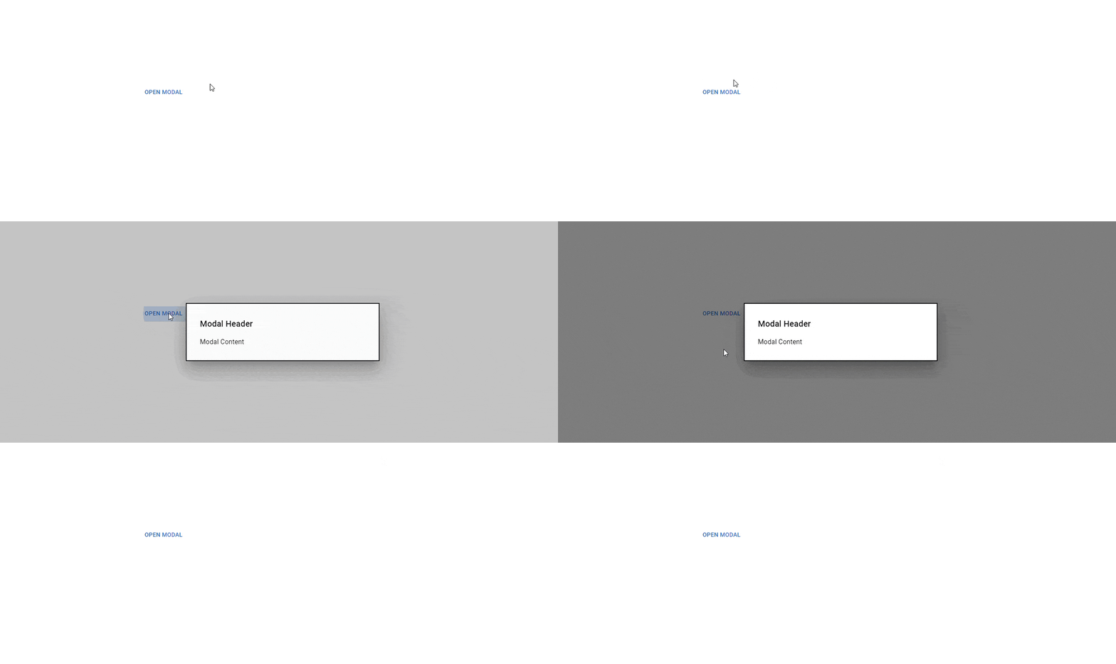
When the modal is closed and fully transitioned, the onEnter and onExited events allow it to unmount the child content like this:
Nested Modals
Modal dialogs nested within other modal dialogs are known as nested modals. This feature lets users view and interact with multiple modal windows simultaneously on the same page. Nested modals can create a more complex user interface with various layers of information or simplify the user experience by providing a more efficient workflow. Nested modals can also be helpful in displaying data more understandably and providing additional context for a user's actions.
import * as React from 'react';
import Box from '@mui/material/Box';
import Modal from '@mui/material/Modal';
import Button from '@mui/material/Button';

const style = {
  position: 'absolute' as 'absolute',
  top: '50%',
  left: '50%',
  transform: 'translate(-50%, -50%)',
  width: 400,
  bgcolor: 'background.paper',
  border: '2px solid #000',
  boxShadow: 24,
  pt: 2,
  px: 4,
  pb: 3,
};

function ChildModal() {
  const [open, setOpen] = React.useState(false);
  const handleOpen = () => {
    setOpen(true);
  };
  const handleClose = () => {
    setOpen(false);
  };

  return (
    <React.Fragment>
      <Button onClick={handleOpen}>Open Child Modal</Button>
      <Modal
        hideBackdrop
        open={open}
        onClose={handleClose}
        aria-labelledby="child-modal-title"
        aria-describedby="child-modal-description"
      >
        <Box sx={{ ...style, width: 200 }}>
          <h2 id="child-modal-title">Child Header</h2>
          <p id="child-modal-description">
            Child Header Content
          </p>
          <Button onClick={handleClose}>Close Child Modal</Button>
        </Box>
      </Modal>
    </React.Fragment>
  );
}

export default function NestedModal() {
  const [open, setOpen] = React.useState(false);
  const handleOpen = () => {
    setOpen(true);
  };
  const handleClose = () => {
    setOpen(false);
  };

  return (
    <div>
      <Button onClick={handleOpen}>Open modal</Button>
      <Modal
        open={open}
        onClose={handleClose}
        aria-labelledby="parent-modal-title"
        aria-describedby="parent-modal-description"
      >
        <Box sx={{ ...style, width: 400 }}>
          <h2 id="parent-modal-title">Modal Header</h2>
          <p id="parent-modal-description">
            Modal content
          </p>
          <ChildModal />
        </Box>
      </Modal>
    </div>
  );
}
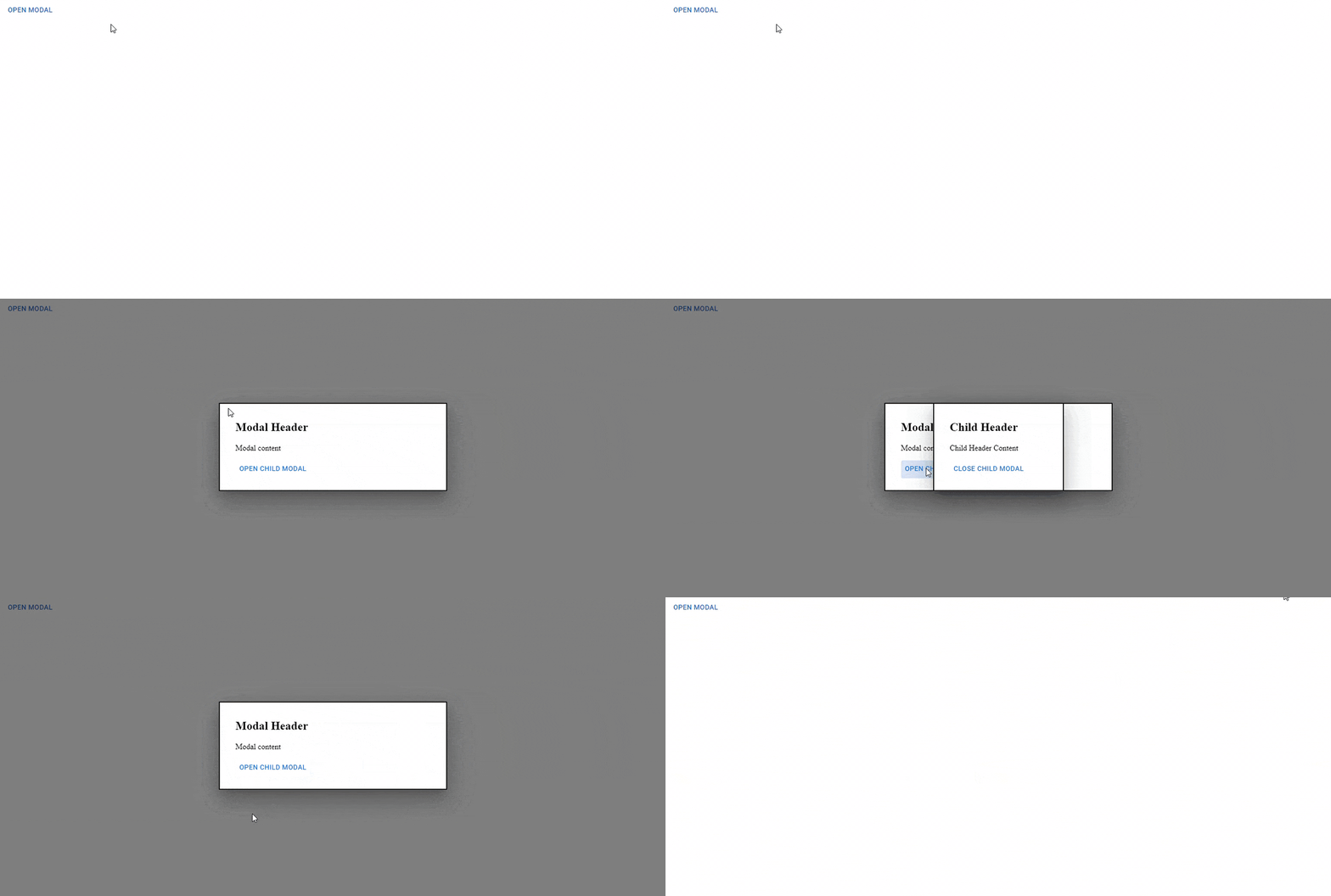
The code above showcases MUI Modal components nested as two clickable modal components.
Here’s the result:
Optimizing MUI Modal performance
Optimizing MUI Modal performance is essential to ensure the best user experience. You can easily optimize your MUI Modal by reducing the number of modal components, using the correct animation techniques, and avoiding unnecessary event listeners. Additionally, it is crucial to use progressive loading techniques, such as lazy loading, to prevent unnecessary resources from loading and impacting the overall performance. Lastly, developers should use proper caching strategies and optimize the loading order of assets to ensure that the modal is rendered as quickly as possible.
Additionally, if you need to make the content search engine friendly or render expensive component trees inside your modal while optimizing for interaction responsiveness, you should change the default behavior by enabling the 'keepMounted' prop, as shown below:
<Modal keepMounted />
Server-side modal
On the server, React does not support the createPortal() API. To display the modal, disable the portal feature using the disablePortal prop.
Material UI Modal limitations
Focus Trap
If the component tries to escape the modal, the Material UI Modal defaults to returning the focus to the component's body. This is done to improve accessibility. However, it may cause problems with the app's overall UX. If users need to interact with another part of the page, such as a menu or navbar, you can disable the Material UI Modal default setting as follows:
<Modal disableEnforceFocus />
Material UI Modal Accessibility
Material UI Modal accessibility is an important feature to consider when creating a user interface. It ensures users can effectively interact with the modal, regardless of their abilities. The modal must be visible, and the user must be able to easily access the content without any difficulty. Additionally, the modal must be accessible to users with disabilities, such as those who are visually impaired. Finally, the modal must be compatible with assistive technologies, such as screen readers, to ensure users with disabilities can access the content.
Here are a few ways in which you can make your Material UI Modal accessible
Focus Management: The WAI-ARIA best practices for managing focus within the modal dialog should be followed by MUI modal components. When the modal dialog is opened, the focus should be set to the modal dialog, trapped within the modal dialog, and restored to the element that opened the modal dialog when it is closed.
Keyboard Interaction: MUI modal components should follow the WAI-ARIA best practices for keyboard interaction. This should include providing keyboard shortcuts to open and close the modal dialog and keyboard navigation within the modal dialog.
Screen Reader Support: MUI modal components should follow the WAI-ARIA best practices for screen reader support. This should include providing roles, labels, and descriptive text for screen readers to understand and interact with the modal dialog.
High Contrast: MUI modal components should provide high contrast options to ensure that users with low vision can read the content of the modal dialog.
Resizable Text: MUI modal components should provide an option to resize the text within the modal dialog to ensure low-vision users can read the content.
Building an Edit form popup with React and Material UI Modal
Using React and Material UI Modal to create an edit form popup is a great way to create an interactive and responsive form quickly. The Material UI Modal component allows for creating a popup with a few lines of code, and the React framework makes it simple to customize the form to the user's specific requirements. Developers can create a quick and simple edit form popup using the React and Material UI Modal combination like this:
import * as React from 'react';
import Box from '@mui/material/Box';
import Button from '@mui/material/Button';
import Typography from '@mui/material/Typography';
import Modal from '@mui/material/Modal';
import contactImage from '../Images/My Photo.jpg'
import EditIcon from '@mui/icons-material/Edit';

const style = {
  position: 'absolute',
  top: '50%',
  left: '50%',
  transform: 'translate(-50%, -50%)',
  width: 400,
  bgcolor: 'background.paper',
  border: '2px solid #000',
  boxShadow: 24,
  p: 4,
};

export default function BasicModal() {
  const [open, setOpen] = React.useState(false);
  const handleOpen = () => setOpen(true);
  const handleClose = () => setOpen(false);

  return (
    <div>

      <section>
      <Button onClick={handleOpen}><p style={{marginLeft: '75%'}}>Edit contact</p><EditIcon></EditIcon></Button>
        <div class='img-div'>
        <img src={contactImage} alt= '' />
        </div>
        <h2><span>Doro Onome</span></h2>
        <h2><span>nomzykush@gmail.com</span></h2>
        <h2><span>09015618845</span></h2>
      </section>

      <Modal
        open={open}
        onClose={handleClose}
        aria-labelledby="modal-modal-title"
        aria-describedby="modal-modal-description"
      >
        <Box sx={style}>
          <Typography id="modal-modal-title" variant="h6" component="h2">
            Edit Contact Details
          </Typography>
          <Typography id="modal-modal-description" sx={{ mt: 2 }}>
            <div className='edit-container'>
               <label for="">Edit Contact Name</label>
               <input type="text"/>
               <label for="">Edit Contact Email</label>
               <input type="text"/>
               <label for="">Edit Contact Image</label>
               <input type="file"/>
               </div>

                            <button class="edit-btn">Save</button>
          </Typography>
        </Box>
      </Modal>
    </div>
  );
}
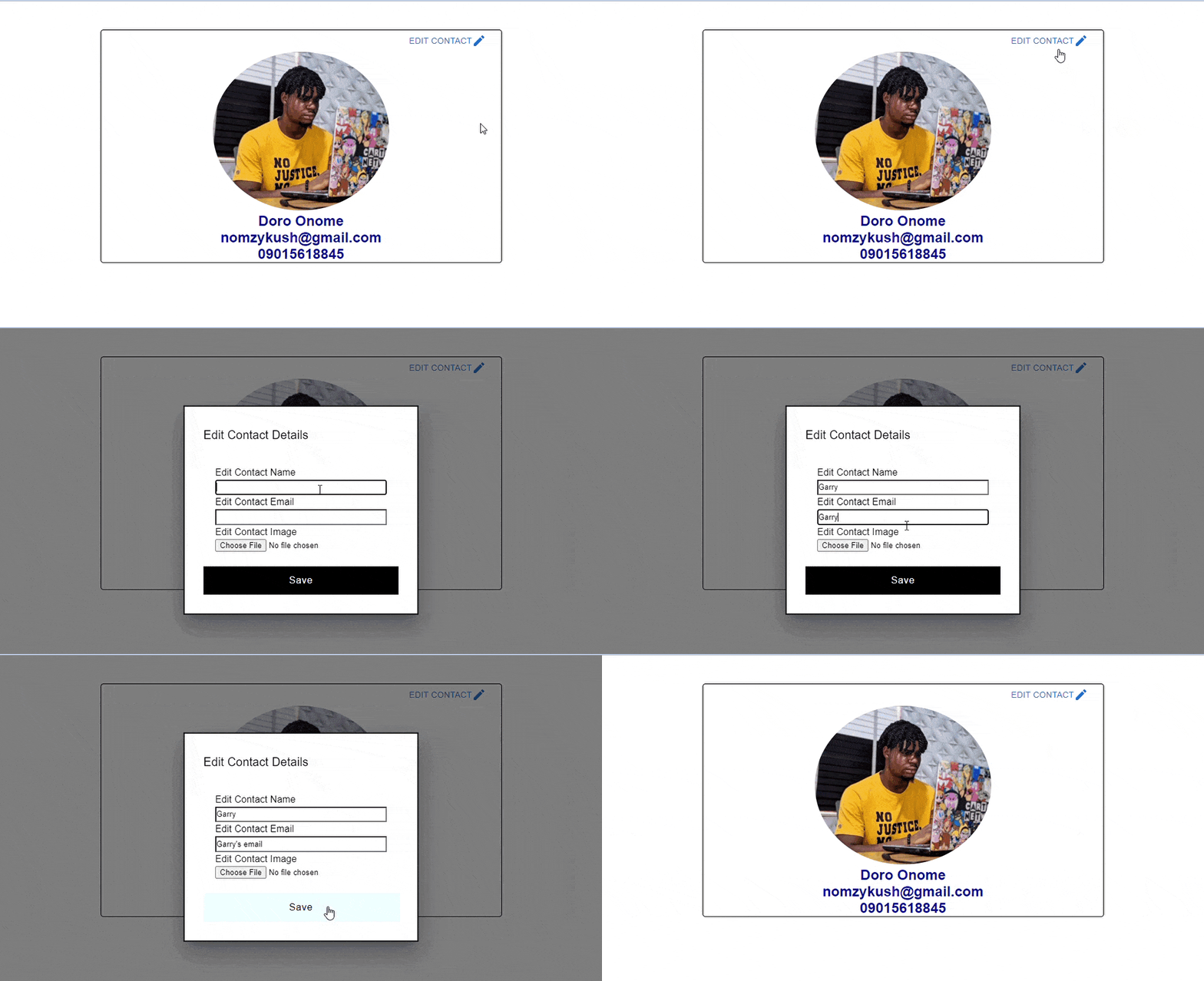
The code above represents a simple contact management page UI where users can easily edit contact details with the MUI Modal.
Here’s the result:
Conclusion
Material UI Modal is an excellent tool for creating a modal window with a native look and feel. It provides a great user experience with its simple and intuitive design. It is also highly customizable, allowing developers to create modal windows with their custom styles. This article thoroughly reviewed the MUI Modal component and explored a use case in the form of an editable contact page UI. With its responsive design and wide range of options, Material UI Modal is a great solution for web developers looking to create modal windows for their projects.

